
A customer walks in with a design on their phone, a budget in mind, and no idea what a blank is. They just want a shirt that looks good and lasts. What you hand them, and what you charge for it, depends on one decision you make before the printer ever warms up: which blank goes under the ink. Get that wrong and you either eat the margin or hand over a shirt that pills after three washes. For a lot of shops, the answer sits somewhere between shaka wear and smart blanks, two names that show up again and again on reorder sheets for good reason.
This isn't a spec-sheet dump. It's a practical look at how these two blank families behave in real print environments, where they earn their keep, and how to decide which one belongs on your shelf for a given job.
Why the blank matters more than most shops admit
Ink gets the credit when a shirt looks sharp. The blank decides whether it still looks sharp after a dozen trips through the laundry. A print can be flawless on day one and fall apart by month three if the fabric shrinks unevenly, the surface finish fights the adhesive, or the seams pull under a heavy design.
There's also a business side. Your blank cost sets the floor for your retail price. A tee that costs you a few dollars more per unit but holds its shape and color keeps customers coming back, which is worth more than the savings from a cheaper option that generates complaints. The trick is matching the blank to the job instead of defaulting to whichever box is closest to the press.
Where shaka wear fits in the lineup
shaka wear has built a following among print shops that want a heavyweight, structured feel without jumping into premium pricing territory. The fabric tends to be denser than a standard budget tee, which matters when you're pressing large DTF transfers or layering multi-color designs. A heavier face gives the adhesive something stable to bond to, and the finished shirt hangs with a bit more body.
Best use cases for shaka wear
- Streetwear and oversized fits: customers chasing that boxy, dropped-shoulder look usually want fabric with enough weight to hold the silhouette.
- Bold front-and-back prints: a denser knit resists the slight puckering you sometimes see when a large transfer sits on a thin jersey.
- Merch drops with a premium feel: if the design is the product, the blank needs to feel like it belongs on a shelf next to branded apparel, not in a giveaway pile.
One thing worth testing on your own press: run a few sample transfers at your normal time and temperature before committing to a full run. Heavier fabric can absorb heat differently, and a quick test saves you from reprinting a stack of shirts.
Where smart blanks earn their keep
smart blanks serve a different purpose. These are the workhorses for volume orders, event tees, team uniforms, and anything where the customer needs a solid shirt at a price that leaves room for your margin. The fabric is generally lighter and softer, which many wearers actually prefer for everyday use, especially in warmer months or for athletic events.
When smart blanks are the smarter call
- Large group orders: school events, charity runs, and corporate outings usually prioritize price and turnaround over heavyweight fabric.
- Soft-hand feel: if the design is small, like a left-chest logo or a back-neck print, a lighter blank lets the shirt feel broken-in from day one.
- Warm-weather and athletic use: lighter knits breathe better, which customers notice fast on a hot day.
The tradeoff is that lighter fabric demands a bit more care during pressing. Keep your pressure consistent and let the transfer cool fully before peeling. Rushing that step is one of the most common reasons a print lifts at the edges, and it has nothing to do with the blank itself.
How to choose between the two for a specific job
The decision usually comes down to three questions, and you can ask them in under a minute at the counter.
- What is the customer's price ceiling? If they need 200 shirts for a 5K and the budget is tight, smart blanks keep the project viable. If they're launching a small streetwear capsule and want the shirt to feel substantial, shaka wear is the better fit.
- How big is the print? Large coverage areas benefit from a heavier face. Small logos and text work beautifully on lighter fabric.
- How will the shirt be worn? Daily wear, layering, and fashion-forward fits lean toward heavier blanks. Event-day wear and one-time use lean toward lighter, softer options.
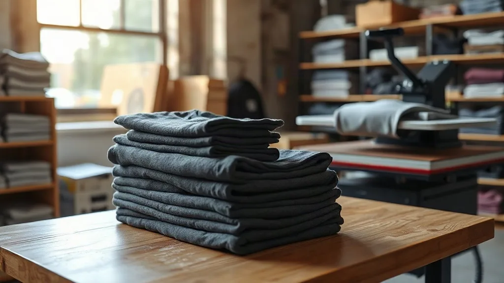
There's no rule that says a shop has to pick one. Most successful print businesses keep both on hand and let the job decide. That flexibility is also a selling point. When a customer asks for options, you can show them a heavyweight and a lightweight side by side and let them feel the difference. That beats a verbal pitch every time.
Sample strategy: build a blank menu, not a single default
Shops that treat blanks as a menu rather than a single default tend to close more orders and field fewer complaints. A simple approach: keep two or three options in each weight class, price them in tiers, and train whoever works the counter to explain the difference in plain language.
For example, a tiered menu might look like this. Entry tier: a lightweight blank for volume and budget work. Mid tier: a midweight option for everyday retail. Premium tier: a heavyweight blank for fashion and specialty drops. When customers see the tiers, they often self-select upward, and your average order value rises without a hard sell.
It also helps to document which blank pairs best with which print method. Keep a simple chart near the press listing your tested settings for each blank family. New employees get up to speed faster, and you avoid the small errors that eat into profit over a hundred shirts.
Common mistakes when picking a blank
The most frequent error is choosing on unit cost alone. A blank that saves a dollar but generates returns or bad reviews costs far more in the long run. The second is ignoring shrinkage. Always check the manufacturer's stated shrinkage and wash a sample before promising a customer an exact fit. The third is skipping the press test. Every new blank deserves a two-shirt trial run before it goes into production.
Finally, don't overlook color consistency across reorders. If a customer comes back for fifty more shirts three months later, you want the same dye lot or a close match. Locking in a consistent blank supplier makes that far easier than chasing the cheapest option each time.
Frequently asked questions
Is shaka wear good for DTF transfers?
Yes. The heavier fabric gives the transfer a stable surface, and large designs tend to press cleanly. Run a test shirt at your usual settings first, since denser knits can behave slightly differently under heat.
Are smart blanks suitable for large group orders?
They're a strong fit for volume work. The lighter weight keeps costs manageable, and the soft feel works well for events, teams, and corporate orders where comfort matters more than structure.
Can I offer both shaka wear and smart blanks in the same shop?
Absolutely, and many shops do. Keeping both on hand lets you match the blank to the job, gives customers a real choice, and often nudges average order value upward when buyers upgrade to the heavier option.
How do I know which blank a customer will prefer?
Let them feel both. A quick side-by-side comparison of a heavyweight and a lightweight shirt answers the question faster than any explanation, and it builds trust because the customer makes the call themselves.
What should I check before committing to a new blank?
Press a sample, wash it, and check shrinkage and colorfastness. Confirm the dye lot for reorders and note your tested press settings so every job starts from a known baseline.